


Last Updated: October 28, 2026
Quick Summary
Modern minimalist kitchen color palettes use a small set of intentional colors, usually split by the 60-30-10 rule: about 60% primary, 30% secondary, and 10% accent. Warm off-whites, soft neutrals, and natural wood tones keep a small kitchen calm and open.
- Assign about 60% of visible surface area to a primary color, such as walls and the largest cabinet run.
- Use a secondary color for roughly 30%, like lower cabinets, an island, or the backsplash.
- Reserve about 10% for accents such as hardware, a pendant, or a countertop accessory.
- Warm off-white paired with wood tones avoids the sterile look of stark white in north-facing rooms.
- Test samples in morning and evening light, since warm bulbs shift colors toward yellow and red.
Table of Contents
- Why Modern Minimalist Kitchen Color Palettes Work in Small Spaces
- The 60-30-10 Rule for Balancing Kitchen Colors
- Warm Minimalist Kitchen Ideas That Avoid a Sterile Look
- Modern Kitchen Color Combinations Worth Testing
- Choosing Minimalist Kitchen Cabinet Colors
- Small Kitchen Color Ideas That Make the Room Feel Larger
- Planning Your Kitchen Palette Before You Buy
- Frequently Asked Questions
Walk into a modern minimalist kitchen and the first thing you notice is the color. Not the appliances, not the storage, just the palette. Get it right and a small kitchen feels open and calm. Get it wrong and the same room feels like a cramped closet.
Minimalist color is not the same as stark white. Most designers now describe a kitchen palette as a small set of intentional choices, each doing a clear job. For practical ways to free up visual space in a compact kitchen, see organize a small kitchen without cabinets.
Why Modern Minimalist Kitchen Color Palettes Work in Small Spaces
A limited palette makes a small room read as larger. When the eye meets fewer color changes, the walls and cabinets recede, and the room feels calmer. That matters most in urban apartments, where the kitchen often sits in a corner next to the stove and sink with very little visual breathing room.
Research from Interior Logic Group's 2026 design survey points to a clear preference: millennials favor spaces that feel light, bright, and free of clutter. Modern white and soft neutral kitchens fit that preference. The palette does half the organizing work before a single drawer gets closed.
The 60-30-10 Rule for Balancing Kitchen Colors
The 60-30-10 ratio is the most practical tool for building a minimalist kitchen palette because it turns an abstract goal ("calm and cohesive") into a measurable allocation. Assign roughly 60% of the visible surface area to one primary color, 30% to a secondary color, and 10% to an accent. The percentages refer to what the eye actually sees, walls, cabinet fronts, backsplash, countertop, and floor, not to the number of paint cans you buy.
How to Measure Your 60-30-10 in a Real Kitchen
Start by estimating visible surface area, not room volume. In a typical 10-foot by 10-foot kitchen with standard 36-inch upper cabinets and a 24-inch-deep counter, the cabinet fronts and walls together account for the majority of what you see from the doorway.
A worked example: warm off-white walls and upper cabinets (60%), white oak lower cabinets or open shelving (30%), and a single matte black faucet plus a pair of olive ceramic canisters (10%). That allocation keeps the room quiet while giving the eye two places to rest, the wood tone and the dark accent.
Where the Ratio Breaks Down
The 60-30-10 rule assumes a neutral primary color. If your 60% is a saturated color, a deep green wall, for example, the same ratio will feel heavier than intended, because saturated colors advance visually. In that case, shift toward 70-20-10 and keep the accent to a single object. Similarly, glossy finishes reflect light and amplify their color, so a 60% share of glossy navy cabinets will read darker than the same share in a matte finish. Most designers treat the ratio as a starting point and adjust by finish and light direction rather than as a fixed law.
A Quick Ratio Checklist
- Primary color (60%): walls, ceiling, and the largest cabinet run.
- Secondary color (30%): lower cabinets, island, or backsplash, one large plane, not several small ones.
- Accent (10%): hardware, a pendant, a runner, or a single countertop accessory.
- Count fixed finishes first: flooring and stone counters are hard to change, so assign them to the 60% or 30% slot before choosing paint.
Naked Kitchens' 2026 color guide describes this as a standard way to build depth without visual noise, and the measurement approach above is how most practitioners apply it in rooms with fixed finishes.
Warm Minimalist Kitchen Ideas That Avoid a Sterile Look
Stark white and cool gray can feel cold, especially in north-facing apartments. Some designers now push back on strict minimalism for this reason and recommend warmer tones. Clare's 2026 analysis of warm minimalism argues for wood tones and earthier hues to keep the space comfortable.
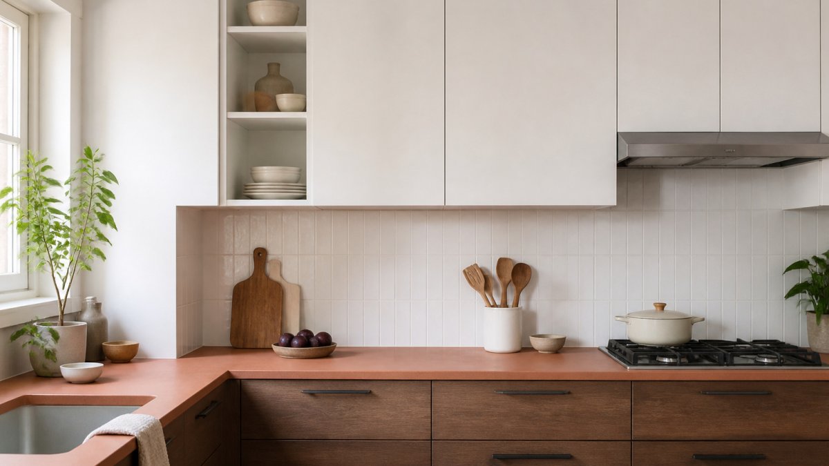
Try swapping a cool white for a warm off-white, mushroom, or taupe. Pair them with natural wood, which adds texture without adding color clutter. A soft terracotta or olive accent gives the room warmth without breaking the calm. The result feels minimal but still lived in.
Modern Kitchen Color Combinations Worth Testing
Some combinations work reliably in modern kitchens. Warm neutrals across walls and cabinets, with a single wood tone on open shelving, is a dependable base. Muted green lower cabinets with white uppers and light stone counters offer a fresher look.
The NKBA and KBIS 2026 Kitchen Trends Report found that neutrals remain the most popular kitchen colors among respondents, with greens and blues also widely chosen. Those findings suggest a neutral base with one cooler or greener accent is a safe place to start for most homes.
Choosing Minimalist Kitchen Cabinet Colors
Cabinets take up the most visual area in a kitchen, so they set the palette. Two-tone cabinetry remains a dominant approach, with lighter upper cabinets paired with deeper lower cabinets or an island. If your corner cabinets are the hardest area to keep tidy, learn how to organize kitchen corner cabinets effectively with pull-out shelves and lazy susan alternatives. Showplace Cabinetry's 2026 trend overview notes that this approach adds dimension without adding extra colors. What most guides skip is the part that decides whether the result looks intentional or accidental: sheen, undertone, and the interaction between cabinet color and the fixed finishes already in the room.
Match Sheen Before You Match Color
Cabinet sheen changes how a color reads more than most homeowners expect. A matte or low-luster finish absorbs light and makes a color look deeper and softer; a satin or semi-gloss finish reflects light and makes the same color look lighter and cooler. In a minimalist kitchen, the common pattern is matte or low-luster on large cabinet runs and satin on the backsplash or trim, so the room has one quiet reflective surface rather than several competing ones. If you are painting existing cabinets, the current sheen limits your options: you can usually go from glossier to flatter with proper prep, but going from matte to high-gloss requires a full sanding and priming cycle.
Read the Undertone Against Your Fixed Finishes
Every cabinet color has an undertone, warm (yellow, red, orange), cool (blue, green, violet), or neutral. The most common failure in minimalist kitchens is a cool gray cabinet paired with a warm wood floor, which makes both look slightly wrong without either being obviously off. Before committing, place a large sample (at least 8 by 10 inches) against the floor, the countertop, and the appliance metal, and view it under both daylight and the room's actual evening lighting. A warm off-white cabinet with a white oak floor and a cool white quartz counter will read as three separate decisions; the same cabinet with a warm white counter reads as one palette.
Two-Tone Cabinetry: Where to Put the Break
The break line between upper and lower cabinet colors is a design decision, not an afterthought. The most reliable placement is at the countertop, so the upper cabinets and wall read as one continuous light plane and the lower cabinets ground the room. Placing the break higher, say, at the bottom of the upper cabinets, creates a visible band that can make a low ceiling feel lower. For a rental or a quick update, painting only the lower cabinets is a visible change that can be reversed; keep the uppers in their existing color and choose a lower color that shares an undertone with them.
Cabinet Color Checklist
- Confirm the sheen of your existing cabinets before choosing a new color.
- Identify the undertone of your floor, counter, and appliance metal first.
- Choose a cabinet color that shares that undertone, or deliberately contrasts it once, not twice.
- Place the two-tone break at the countertop line unless the ceiling height argues otherwise.
- Keep hardware in the 10% accent slot so the cabinet color stays the dominant decision.
Small Kitchen Color Ideas That Make the Room Feel Larger
Light, low-contrast palettes do the most for small kitchens. Keep walls and ceilings in the same family so the eye has no hard edge to stop at. A slightly lighter ceiling than the walls can add height. Use a glossy or satin finish on cabinets to bounce light.
Dark accents can work in small spaces, but use them carefully. A deep green or charcoal on lower cabinets can ground the room. Keep the upper cabinets and wall light so the space does not feel closed in.
Planning Your Kitchen Palette Before You Buy
Start with the room you have, not the one you see online. Note the light direction, the flooring tone, and any fixed finishes like stone counters or appliance metals. Those are harder to change than paint, so build the palette around them.
Next, pick the three colors that follow the 60-30-10 ratio, and write them down. Order samples and check them in the morning and evening. Finally, plan your storage and accessories in the same palette, so a sink organizer or utensil holder matches the room instead of fighting it. SinkElle's Scandinavian-inspired sink organizers install without tools.
Before you buy paint, lay out the core facts of a minimalist palette in one quick reference.
| Step | What to do | Note |
|---|---|---|
| Note fixed finishes | Record light direction, flooring tone, stone counters, appliance metals | Hard to change, so build around them |
| Assign the 60-30-10 split | Primary 60%, secondary 30%, accent 10% | Counts visible surfaces, not paint cans |
| Pick three colors | Write down one color per ratio slot | Keep the palette to three |
| Test samples | Check in morning and evening light | Colors shift under warm bulbs |
| Match accessories | Choose storage and accessories in the same palette | Prevents clashing items |
Frequently Asked Questions
What colors work best in a modern minimalist kitchen?
Most modern minimalist kitchens rely on a primary neutral such as white, greige, or soft gray, which covers roughly 60% of the room. A complementary second color, often mushroom, taupe, or warm wood tones, typically fills about 30%. The remaining 10% is a bolder accent, such as olive, deep green, or terracotta, applied through hardware, a backsplash tile, or small accessories. Recent NKBA-KBIS 2026 Kitchen Trends Report data found neutrals were the most popular kitchen colors among respondents, with greens and blues also widely favored.
How do you make a minimalist kitchen feel warm rather than sterile?
Introduce warm neutrals and natural materials instead of stark white and cool gray alone. Mushroom, taupe, and earthy tones like terracotta and olive add comfort without clutter. Wood finishes on lower cabinets, open shelving, or a butcher-block island add texture. Designers sometimes call this approach warm minimalism. Keep the number of colors low so the room still looks calm and intentional.
What cabinet colors work well with minimalist kitchen design?
Two-tone cabinetry is a leading 2026 trend, pairing lighter upper cabinets with deeper lower cabinets or an island. This adds dimension while keeping the palette restrained. Soft whites, greige, and muted greens are common choices for minimalist kitchens. Matching hardware finishes to the accent color keeps the look cohesive.
What colors make a small kitchen look bigger?
Light, low-contrast palettes generally make a small kitchen feel more open. Soft whites and pale neutrals reflect more light, while a consistent color across cabinets and walls reduces visual breaks. Use the accent color sparingly, such as on a single backsplash or hardware, so the room does not feel crowded. Test paint samples in your own lighting before committing, since north-facing rooms often look cooler.
